Customer service redesign
Information architecture improvements reduced customer service processing time by 53%
Project Summary
I led the redesign of our Customer Service Hub, facilitating cross-functional collaboration and designing a dynamic contact form with automated routing. By designing for both customer and agent needs, we created compounding improvements; customers got faster service while agents gained improved workflows.
Scenario
Our customers loved the support they received from our customer service team, but sometimes faced long waits for email responses.
Internally, customer service agents still spent significant time on requests customers could self-serve via the website. Emails lacked prioritization and routing, resulting in these high response times.
Understanding the Problem
This project required solving for both customers and agents, as well as operational business metrics we were aiming to affect.
| User | Pain Points |
|---|---|
| Customers | Self-service tools and information existed but weren't visible |
| The generic contact form didn't help clarify specific issues | |
| Long response times (32.9 hours average) | |
| Agents | Emails arrived without categorization/prioritization |
| Agents spent time on requests customers could self-serve | |
| Lacked specific information needed to process inquiries |
Business Goals: Reduce email processing time by 10% and increase emails processed per hour by 10%.
The current state featured a generic form with too many required fields, FAQs were buried, and internally, agents lacked the details needed to efficiently process requests.
Discovery
I started by collecting all available behavioral data and reviewed the experience for both customers and agents. I spoke with the customer service team to understand the context of their pain points and the types of information they would need for each request type. Additionally, I worked on a card sort study to understand how we might group the FAQ topics to match users' mental models.
Methods:
- Behavioral data analysis of contact pages to understand top tasks
- Data input mapping with Customer Service team
- Open and closed card sort study for FAQ topics
- Best practice and competitive review
Based on the discovery findings, some design principles for the redesign took shape:
- Aim for a clean and simple design using brand styles, with clear headers and labels that match customer expectations
- Maintain a 'hub and spoke' information architecture, with similar help topics 'chunked' together for easy navigation
- Top user tasks identified to prioritize for clear and easy wayfinding
- Keep contact details easy to find to build/maintain trust
Collaboration with Customer Service
Together with customer service leads, I ran a design thinking workshop to understand what information agents needed to process requests, and how they would organize incoming messages.
Based on the discovery work and the input from the team, I developed key principles for the contact us flows:
- Minimum required fields to avoid user drop-off
- Progressive, dynamic process that guides step-by-step
- Helpful links without dead ends
- Phone number prominently displayed
Through the collaboration with customer service, it became clear that both internal and external users would benefit greatly from small improvements to information architecture and navigation.
Design Updates
1. Self-Service First
Added prominent links to Track Order, Returns, Quotes, and Order History—redirecting users to self-service before they reached the form.
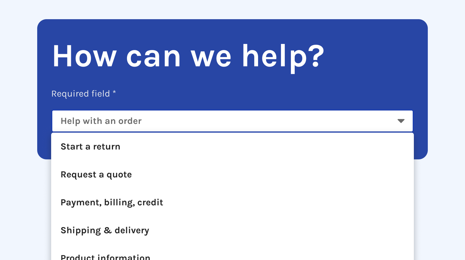
2. Dynamic Contact Form
Created a "Subject" dropdown that dynamically populates relevant fields based on selected topic. Only Name, Email, and Subject required; each category surfaces specific information agents need.
3. Automation & Routing
We partnered with Engineering to build tagging, prioritization rules, and automated routing for urgent cases—transforming the form into a triage tool.
4. Accessibility
Because contact forms are critical accessibility touchpoints, I documented designs for tab order and ARIA labels, and conducted VoiceOver QA testing to ensure keyboard navigation worked properly for users with disabilities.
5. Brand styles
To bring the customer service pages into a more modern and branded look/feel, I also applied brand colors and page striping, as well as components and styles from our design system team.
The redesigned Customer Service Hub features a dynamic form where fields adapt based on inquiry type, while automated routing ensures urgent issues get immediate attention.
I worked closely with other designers to review and iterate on the styling, ensuring visual consistency across the experience. We leveraged the brand's existing color system and component library to maintain a cohesive look while improving usability.
The updated hub elevated the onsite experience by surfacing top tasks front and center, emphasizing self-service, and providing agents with a triage tool for better data collection and routing.
Results
Exceeded all goals (May–October 2025):
- Email response time: 53% improvement vs. 10% goal
- Emails processed per hour: 14% improvement vs. 10% goal
- Faster resolutions and better SLA performance
- Reduced form abandonment
- Better workload management for agents—urgent issues handled first
This redesign allowed us to build an MVP that exceeded target goals and established a reliable information architecture we could continue building on.
"Hi Kevin!!!!! Basically, we rocked it…. we've been able to process more time-sensitive cases before those that aren't as critical. Each day, a manager directs CSAs to specific buckets to work, prioritizing these requests, such as cancellations." - Customer Service Manager