Redesigning product cards at scale
Designing for readability and consistency led to a 5.6% increase to conversion rate
Project Summary
I led a system-wide redesign of product cards across a B2B e-commerce website, improving readability and consistency through auditing, user testing, and building a scalable, cascading component system.
The changes resulted in a 5.6% lift in conversion, showing that small, systematic changes to spacing, typography, and hierarchy compounded to create measurable business impact while also solving operational challenges.
Scenario
Product cards appeared throughout our customer journey—from search results to recommendations to cart. Poor readability, inconsistent visual design, and lack of brand alignment created friction throughout the journey. Additionally, front-end engineers and designers lacked a clear pattern to follow across product teams, leading to confusion and further inconsistencies. Yet this wasn't flagged as an urgent problem by business or product teams.
This problem space was a design-led initiative from the start, one driven by the belief that stronger UX and UI could impact business metrics.
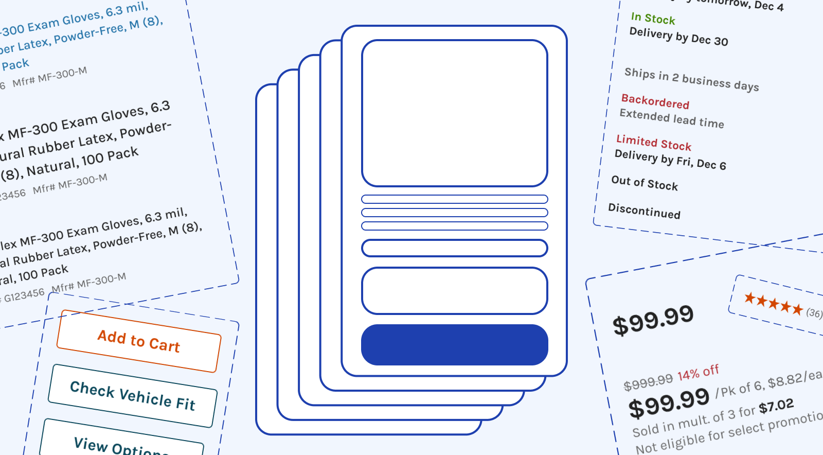
Component Audit
I began with a comprehensive audit of all product cards across the site. By doing this work upfront, I was able to view all card instances and group issues into solvable design problems.
I organized card elements into three groups:
| Group | Element Examples |
|---|---|
| Core details | Title, price, part numbers |
| Status & Badges | Availability, promotions |
| Actions | Add to Cart, Compare |
My audit ultimately contained 20+ pages of unique instances of product cards across the customer journey.
Starting with a comprehensive audit revealed inconsistencies we wouldn't have found otherwise; it provided the foundation for strategic, systematic improvements.
The inconsistencies created an argument for updating and scaling with design system styles. Given the cross-team scope and lack of a direct tie to business goals, the project had no natural owner—so I worked to build support across design, front-end engineering, and product management to get it off the ground.
Concepts
What really helped to get this work prioritized was showing the problem visually - concepting updates into prototypes and showing the obvious UI enhancements to all stakeholders and designers involved.
The audit findings allowed us to digest and organize the problems to solve with the design:
- readability and legibility of product information
- a balanced visual weight of buttons and actions
- improved closure on cards
- overall consistency across all instances - designs need to work for cards small, large, and in between
To solve for these, I designed some small improvements:
- Increased title size and weight to medium, and removed truncation of key product text
- Used secondary styling on buttons
- Added a background color for cards to sit against, providing visual closure between items
I spent time reviewing with other designers who worked on teams that would be impacted by these changes, and we critiqued and stress tested the concepts into their layouts.
To stakeholders and other designers alike, the visual and UX enhancements were an obvious and worthwhile improvement, even if they didn't necessarily connect cleanly to a business OKR.
Concept Testing
To help guide the finalization of the design work, I conducted usability testing with early concepts to evaluate scannability and ease of comparison.
Key Findings:
- Larger images, bold text, and bordered segments improved readability
- Truncated titles and deprioritized brand labels caused confusion
- Product titles, images, and promotional badges aided scanning
Due to testing early, user feedback about truncated titles and brand visibility was caught before development began. We were able to iterate on the design before this went into development.
The Solution
The redesigned cards focused on legibility, consistency, and scalability.
Key Changes:
- Consistent, branded badge styling
- Larger text sizes emphasizing product titles (full titles, not truncated)
- Secondary button style for Add to Cart to reduce visual competition with product info
- Gray background on product list pages for improved closure between cards
- WCAG AA compliant contrast ratios
While individual changes were subtle, together they made product information dramatically clearer and more consistent across the website.
A/B testing proved that small, systematic changes to a foundational component delivered measurable impact: a significant 5.6% conversion lift, plus directional gains in search, add-to-cart, and recommendation engagement.
Building the updates into our process
To finalize and evangelize these changes across teams, I built a scalable component system and published the components as a library accessible to all designers.
Because some card elements belonged to other designers (for example, shipping/delivery messaging was owned by another team), I set up components to cascade their owned elements into the card design.
- Detailed Figma components for each element
- Design documentation for designers and developers
- Coordinated rollout across all touchpoints with Engineering
The component-based system created consistency and helped scale the changes across various product teams; anyone who needed product card elements could pull from the Search team library.