Tables for B2B e-commerce
Prototyping and collaborating toward a new product listing format
Project Summary
I led design work for a new B2B product listing format, helping stakeholders visualize complex IA approaches, and running usability tests to gain insights for targeted improvements to the search/browse experience.
Customer Problem
Industrial B2B customers searching for spec-heavy products on our website were overwhelmed by hundreds of thousands of confusingly similar results. Even after filtering results, customers couldn't easily find, evaluate, and compare technical products.
Discovery
I led the discovery and design for the new listing format to help customers narrow and compare spec-heavy products. Due to the scale of the product catalog, this was a complex problem requiring coordinated expertise across multiple disciplines, including analytics, data science, and merchandising. To help the team understand the problem space, I used FigJam boards to visualize the customer journey and collaboratively dig into competitive reviews.
Through this discovery process, we identified a handful of user goals to consider:
- Narrow down to specific parameters
- See comparable items (different prices, sizes, materials)
- Find the best-priced item with acceptable delivery
As part of discovery, I mapped possible navigation journeys to visualize how users might flow into the tables.
Information Architecture
Before designing the interface, I also needed to understand the information architecture for this listing format.
- Was this intended to be a leaf-node category?
- Was this group of SKUs a 'product family' of sorts?
- What shared language are we using to refer to these groupings?
- Was it a parent/child relationship with a main parent and several versions as children?
There were many questions to sort out, and this required conversations to establish a shared definition and idea of how we would model these product relationships.
I explored two approaches to product grouping IA:
| Approach | Description |
|---|---|
| Parent Product Groups | Display products as grouped families, guiding users to narrow scope by selecting their preferred child SKU |
| Collection Groupings | Tables that align with customer mental models and other B2B experiences, allowing visual comparison within collections |
To help the team understand the impact of these IA approaches, I then prototyped each approach and provided interactive links so stakeholders and partners could try them out as we determined how this might work. We ultimately decided to pursue the Parent Product Groups, deeming them more flexible for the typical search-based experience.
Real Data Prototyping
One of the biggest challenges for the team was structuring the data and building product groups. Even though product grouping data wasn't finalized, I still needed a way to prototype and explore potential scenarios, and then use those prototypes to help demonstrate the impact of product data approaches.
Plugging in real data: I worked with data science teams to export the latest product datasets directly from BigQuery, then used a Google sheets Figma plugin to import the data into my prototypes. This allowed me to preview data in context and have productive discussions about organization and display.
To ensure this was shared knowledge within the design team, I documented the workflow and walked other designers through the process, making real-data prototyping accessible to the broader team.
By prototyping and testing with real product data, I helped partners, stakeholders, and test participants see a visual representation of complex and fluctuating data models.
Concept Testing
Throughout the project, I guided the research strategy, defining key questions and partnering with UXR to execute moderated usability testing with low-fidelity prototypes. We had participants navigate the concept flow and react to various UI approaches.
Key Findings:
| Finding | Detail |
|---|---|
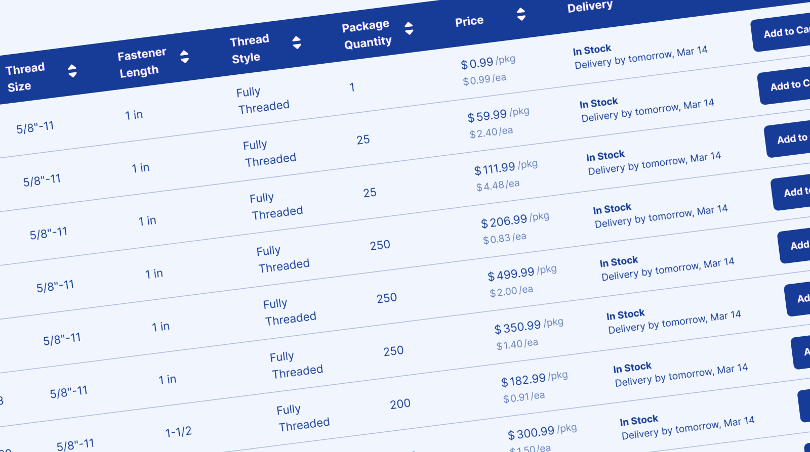
| Format preference varied by product type | Tables worked well for complex technical products (fasteners), but easy variant dropdowns were often preferred for less-technical items (gloves) |
| Expertise influenced usability | Expert buyers preferred tables for scanning specs; casual buyers found dense tables overwhelming |
| Users identified key table features | Visible images per row, easy Add to Cart access, and built-in filtering were top requests |
Testing revealed that technical products would benefit from a dense table layout while more straightforward products would benefit from a typical B2C e-commerce experience.
Design Collaboration & Mentorship
While I led IA, strategy, and prototyping, I partnered with a mid-level designer on the table UI exploration. I framed the problem space, shared discovery findings and wires, and gave them autonomy to explore solutions rather than prescribing an approach.
Throughout the project, I coached them on presenting design rationale to stakeholders—a skill they wanted to develop. By project end, they were confidently leading reviews and defending design decisions independently. This freed me to focus on the higher-level IA and data strategy conversations while building their confidence and visibility.
Delegating with clear framing and regular feedback built the designer's skills while freeing me to focus on strategic decisions.
MVP Launch
As an initial test, we launched Product Group Pages (PGP) as an intermediate layer between search results and SKU pages, providing a way to narrow scope with clear wayfinding. This enabled merchandising teams to decide on which categories should get table-view and then implement them only on those categories.
As we built out the MVP, I also partnered with Engineering on a thorough VQA review, including for accessibility, conducting VoiceOver reviews and ensuring all elements were keyboard navigable with appropriate ARIA labels.
Usability Testing
While the A/B test ran, I set up an unmoderated usability test to gather qualitative feedback on the experience. I asked users to search and browse for specific items using the live site. As the A/B test was a 50/50 split, half the users saw the control experience while half saw the test. This allowed us to observe and compare the experience directly between control and test groups.
"Without the usability study running alongside the A/B experiment, we would not have had any actionable insights to make updates." — Technical Product Manager
Results
A/B Test Result: No measurable change in customer behavior metrics.
Learnings from usability testing:
| Finding | Detail |
|---|---|
| Search specificity creates expectations | As users search with greater specificity in their keywords, they expect more precise SKU results, whereas broad product groups didn't meet that expectation |
| Browse paths outperformed search | Category browsing paths were more successful because users anticipated needing to narrow down |
| Tables aided comparison | Table UI made SKU comparison easy for spec-heavy products |
Strategic Impact: This work established a foundation for continuous navigation improvements and informed the product roadmap with actionable UX research findings.
Ultimately, the data-driven design approach and usability findings helped to inform how we could solve product information problems and set a foundation for enhancing the technical product browse experience.